Top 10 Bathroom Trends for 2022

We are whisking you into 2022 with the Top 10 Trends you will want to incorporate into your next Bathroom Renovation.

Tranquility and respite loom large as we slowly exit the days of the pandemic, and we experience more life outside the house, but still crave the cocoon of “home”, to recharge & reset.
Some of the trends are fashion-focused, while others point straight at better living.

  1. Biophillic Spaces

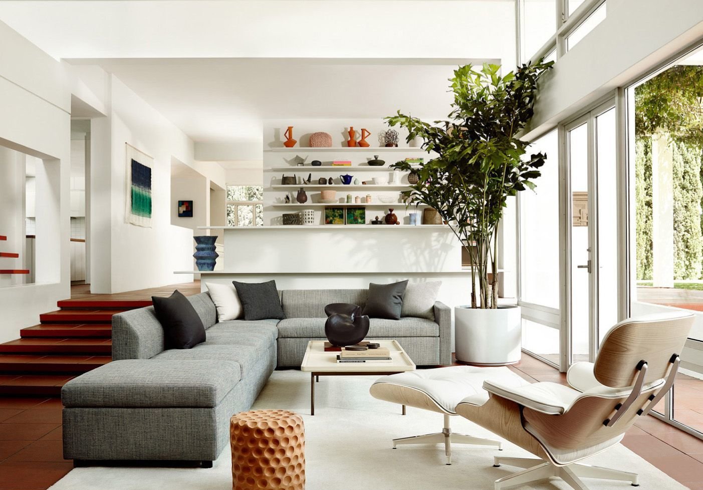
Biophilic Interior Design means incorporating nature into our indoor environment. It comes from the word Biophilia – meaning Love of Nature. Biophilic Design focuses on creating a calming space with a visual connection with nature while improving wellbeing, health and productivity.

The term translates to the “love of living things’ in Ancient Greek.

These spaces make us of natural materials, like wood, water, greenery & natural light.

2. Wet Room

Creating an all-in-one wet experience has become increasingly popular year after year. The shower & tub are in one space ( sometimes toilet too ), which is tiled from floor-to-ceiling. The entire area is meant to accommodate water & therefore outfitted with water-proof fixtures & accessories.

The Wet Room piggy-backs onto the biophilic design idea, creating a totally immersive experience with water. No hard lines between contrived “areas”, the entire space is usable and fluid and creates a natural, boundless environment.

3. Statement Sinks

Bold colour, shape and texture are all on the menu when it comes to the lav. Why go simple white when there are so many punchy options on the market now? Enameled Steel, Coloured Concrete and painted Stone, are all materials of choice. Even hand-painted artistic options, as little works of art.

By British Company “Kast”

4. Pale Blue

A true “colour” to add to the beloved natural palette ( white, black, natural )…..pale blue is showing up everywhere as the accent colour of choice. We are seeing it in tiles, sinks, and even ceramic fixtures.

We love the idea of a soft blue handmade tile …… it’s just enough kick to take the bathroom design to the next level, and soft enough to harmonize with neutrals without being a fiery statement unto itself.

5. Hexagons ( still )

This trend is persisting and showing up everywhere ! From mirrors to tiles, to Wallpaper prints and more. Hexagons lend a “deco” feel to the bathroom, and harken back to more Glamourous styles from the 80’s or even the 40’s !

6. Freestanding Sinks

This is a real statement ( and may we note, not one you want to make if you are desperate for counter space/storage ). But, in a powder room or guest bath, how fantastic !? We are seeing freestanding columns built of wood, steel, metals, limestone and porcelain. The look is super mod, clean lines, simple.

7. Copper Finishes

Speaking of metals……

We have seen a lot fo Gold, Burnished bronze, and even Rose Gold……now Copper seems to be taking it’s turn. The rust/brown undertone of this metallic is so nice and warm…..we’re envisioning it paired with baby pinks, soft greens, and luxe matte black…

8. Heated Floors

Comfort is always in style, right ? There’s honestly nothing nicer that feeling toasty in the morning…especially during these coming months. We’ve installed heated floors so much over the years, and every client always says that they are “sooooo glad” they made the decision to add them. So much so, that they don’t even know how they lived without them in the past !

Although not a NEW trend, we see this coming to be a staple of bathroom design, rather than a perceived “upgrade”.

9. Modern Victorian

Intricate patterns and shapes, and beautiful details are the quintessential to Victorian styling. Throwing in unexpected colours, or contrasting style elements ( think Art Deco mirrors, punchy colours, and unexpected prints ), takes this style to a new, modern level.

10. Wallpaper

Wallpaper, officially “back in style”, can quite literally transform a basic bath to a Style Haven. Shown here, a simple ivory & black check pattern, elevates the BNW Basic bath with a layer of intentional style. Here the drama is in the pattern. Alternately, you can choose a bold print that offers strong colours, loud prints, even a mural. Wallpaper can be done above 1/2 wainscotting, or floor-to-ceiling, or even just as a feature wall, if you don’t see yourself committing fully.

15 Ways to Add Storage to Every Room

I’m not sure we could recall the number of times clients have protested their lack of storage in their home. Funny enough, we hear this from couples with small condos, AND from couples/families with large homes in the suburbs.
We never have enough SPACE for all of our STUFF do we ?!

Here are a few tricks and Design hacks we’ve collected along the way, to help you stretch the usage of every last square foot.

Kids-room-storage-idea.jpg
  1. Hallway Credenzas

Useful for just about everything entry & exit- a catch-all for keys, gloves, mitts, letters, gifts, purses, umbrellas. Basically this piece manages the “comings and goings” of the household.
Although tempting to keep the hallway open and unobstructed, the usefulness of a credenza can outweigh the feeling of airiness.

130234597_4736912016381144_2819052123172690123_n.jpg

2. Banquette Seating/ Under Window Cabinets

Wherever there is a large window, we always wonder whether a long bench beneath would be helpful. Serving as extra seating, a cozy book nook, and, ultimately, housing storage below.

window-seat-with-storage-070121-1125-02.jpg

3. Kid’s Centre

Harmonize a kid’s play area by focusing it around 1 piece of furniture that acts as a Multi-platform. Something that can hold books & bins for toys, all-the-while looking pretty ( of course ! )

Kids-room-storage-idea.jpg

4. Radiator Covers

If you are in an old house, you know those radiators take up a lot of space. Creating Radiator Covers, enables you to at least, have a useable “surface”, atop.

image0.jpeg

5. Wallmounted Pots & Pan Holders

We all know this one, as the look has become increasingly popular. But, it takes a bunch of useful items, out of your cabinets, and keeps them “at-the-ready” for your next cooking event. Plus, we love the visual of something unique, like this Copper one.

6. Mudroom Built-Ins

We do TONS of these. There’s nothing nicer than walking in and having a “Spot” for everything. And for every family member !

black-built-in-mudroom-bench_31dbd36d-93f2-44d5-9e3d-8ddb6197f764.jpg

7. Recessed Medicine Cabinets

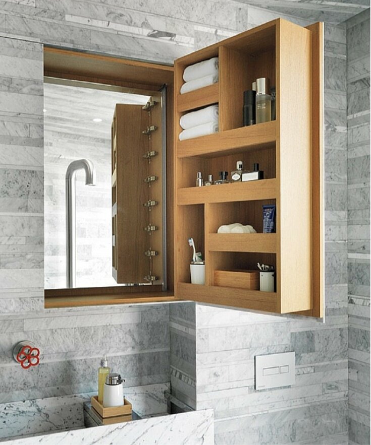
One of our favourite Storage Solutions for the bathroom comes down to a neatly recessed Medicine Cabinet to house all the small, important things. When closed, it’s a seamless look.

Pinterest-image-5-no-text.png

8. Smart Vanities

Not all vanities are created equa! We do many custom pieces for clients that are tailored to their specific storage needs. Often we add in GFI’s, blowdryer & curling iron holders, pull out drawers & dividers, all made to spec.

kohler-bathroom-plumbers-supply-co-img~04e127aa056f5f13_4-4653-1-a478bdc.jpg

9. Built-In Bookshelves

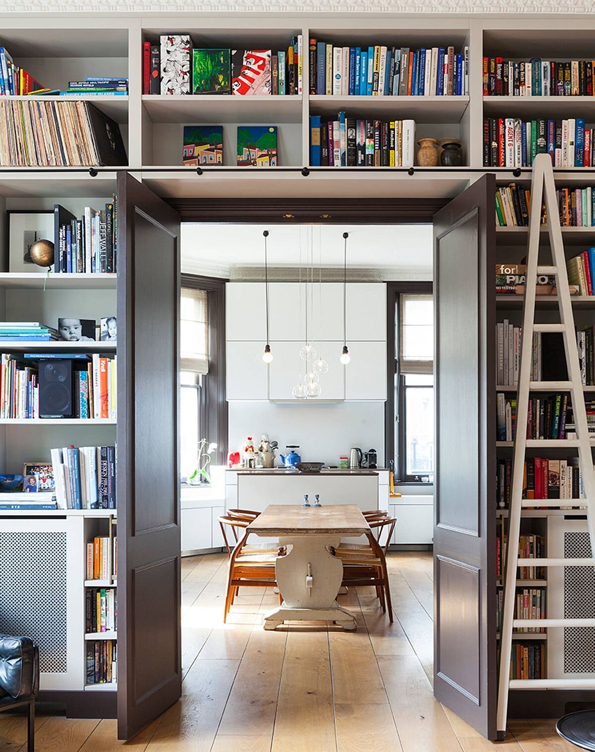
We love building these to flank doorways, windows & media units. Essentially the bookcase is a super-useful “wall”. You can have some fun with these, painting them out in vivid colours, or wallpapering the back, or simply painting them to match the other walls.

Doorway-with-built-in-shelves-around-it-delineates-the-kitchen-and-the-doorway.jpg

10. Creative Bedroom Set-ups

If you have a good carpenter ( ah-hm, ah-hm ), you can really get creative in the build-out of your kids’ bedroom. With enough cabinets, all the toys just might make their way off the floor ( or not ! )

11. Cabinets Under the Stairs

This useless little space can easily be transformed into prime real estate. Custom cabinetry that follows the staircase can be used for dead storage ( think - old bins of paperwork, and things you basically NEVER access ), or for Wine Storage ( we just did this for a client ! ), or extra toys, cleaning supplies….you name it.

John-Lewis-of-Hungerford-under-stairs-storage-cupboards.jpg

12. Deck Seating

Let’s not forget the outdoors. If you are going to the trouble to build some wood seating on the deck, consider making some of it dual-purpose, with pull-out drawers. Here you can keep outdoor dining placemats, beach towels, outdoor toys, pool toys, umbrellas, outdoor blankets, and more.

13. Wrap-Around Shelves

We challenge you to think non-linearly when it comes to shelving ! Sometimes, shelves can go longer, and wrap further, than you might think. Doing this can often create a “nook” or a deliberate “space” in the home, that connotes a certain vibe, or sets the tone for a certain activity.

storage-ideas-hbx010109-091-1-2-1559076872.jpg

14. Dual-Purpose Furniture

Anything that serves as a “surface” and a “storage container” is aces in our books ! Ottomans or coffee tables with storage (like this one from CB2) are often exceedingly useful in small spaces.

spin-rotating-coffee-table.jpg

15. Double Workstations

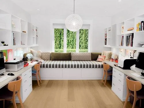
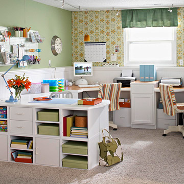
The #WFH Office, now oh-so-coveted, can be built for 2, as easily as it is for one. Employing principles of symmetry & a plethora of built-ins or shelves, you can get everyone’s STUFF into one unified Home Office.

darcy-miller-craft-studio.jpeg

7 Steps to Creating a WFH Office in Your Garage or Shed

We’ve all heard people talking about carving out space in their homes for quality Home Offices. With the pandemic, the little nook under the stairs that held a laptop, a week’s worth of mail, the kid’s coats and a couple amazon packages, no longer sufficed. We all looked to create a more intentional, sustainable space to Work in , while Working from Home.

If you are fortunate enough to have the funds, you can really double down on this new Lifestyle, and create a more robust Office Space in either the Garage or the Shed. This trend is definitely picking up steam, as people look for ultra quiet spaces that are “essentially home”, but distinct from home at the same time.

Here are the Steps you can take to Transform your Garage or Shed into an Inspriing, Creative, Productive space ( with the help of the Pros, of course ! )

Contemporary-home-office-set-in-a-garage-is-both-gorgeous-and-efficient.jpg
  1. Figure Out who is going to work in the space and whether they need a collaborative desk setup, or a singular desk-setup.

Determining who is working there, and HOW they work, is crucial. If you anticipate having colleagues through, you might need to create satellite workspace or a communal desk/table for a causal meeting.

If you plan to work in there while your partner is also working, that might determine how you want to configure the space ( who gets the window view ?!). Considering Layout can help you determine where to place outlets.

Garage-home-office-with-chalkboard-wall-has-both-industrial-and-midcentury-touches.jpg

2. Run electrical, Insulate, & Consider the flooring.

The garage might be a suitable size,, but the comfort of working in the garage or shed will be determined by proper insulation, which will then require drywalling.

Before you do, have your electrician in to wire for proper lighting and outlets. Likely your garage doesn’t have sufficient overhead lighting and new wiring will need to be done. Prepare your space for a mix of overhead light and cozier task lighting.

Have your drywaller create a finished ceiling, or paint-out an exiting wood ceiling.

Same goes for Flooring. Simply sealing the concrete might be the Modern-Industrial look you love. Conversely, some comfy carpet tile or Laminate Flooring might go a long way to making it feel like a cozier space.

3. Consider Replacing the Garage Doors with Glass Sliders.

Glass Sliding Doors will let in a flood of light ( floor-to-ceiling, in fact !) You can modify with blinds for privacy. Same goes for your Wood Shed Door —- Replace it with a beautiful French door.

Turn-the-garage-into-a-cool-and-lovely-home-office.jpg

You can also substitute Traditional Garage Doors for Ones with Glass or Frosted Glass.

689aa780998200de06824a3b6d392285.jpg

5. Consider Your organizational Needs.

Likely, the garage or shed has nothing more interesting than 4 walls and possibly some makeshift-shelving. You will need to look past that and envision how to organize your storage needs. Will you do built-ins? Floating Shelves? Bookcases? What do you need to store there and how much room will be taken up with “stuff” as opposed to workable space. Working with a custom cabinet-maker can help you make the most efficient use of your space.

at-style-2020-09-WFH Garage-Seth_202009613.jpg

6. Think about “Next-Level” Liveability.

Could the space benefit from a little kitchenette? A pull-out bed? ( will it double down the line as an Airbnb or a crash-pad for a returning University student ).

kitchenette-guest-house-garage-coversion-la-shantyi-wijaya-allaprace-properties-3.jpg

7. Have fun with some Stylish Design Elements

If you are truly going to be spending a large amount of time in there, you will want your new Home Office to feel inspiring and beautiful. Maybe installing some decorative ship-lap makes your desk wall extra special. Maybe a floor-to-ceiling Chalkboard wall brings some fun into the space.

Maybe it’s a little reading chair /nook with a fun print and cozy rug.

Whatever you do, make the space “yours” and not sterile.

Screen Shot 2021-08-02 at 7.28.34 PM.png
Smart-way-to-stack-up-the-books-in-the-reading-nook.jpg

Taking the Indoors OUT | 9 Steps to Beautiful Outdoor Living

Is it patio season YET ? We are all so anxious to get outside and start living again ( socially distanced of course ;) ) We miss the sun on our face, and the little pleasures of being in nature. Everyone is looking to amp up their Outdoor space to be able to get the most out of these pandemic times.

Here are 9 Ways to Dress up your backyard Living Space.

  1. Invest in a Comfy Sofa

A cushioned sofa, preferably in a cozy L-shape or a pair of settees, can establish a dedicated conversation area. This brings a real “family room feel” to the backyard. The yard becomes a place where you want to spend time, snack, relax & chat with friends.

IMG_2965.JPG

2. Have a Pergola Built

Likely the most expensive of all the backyard investments, but truly the game-changer. Building out a dedicated space to either relax or dine, creates a feeling of togetherness, and a bit of privacy. It will also provide some sun relief on those sweltering hot days. We love decorating these with twinkly lights, edison bulbs or vines. Cedar wood is naturally resistant to rot, decay and insects. Alternately you can use a composite material that looks just like real wood. Consider hiring a professional to build the Pergola design of your dreams.

IMG_2969 2.JPG

3. Add an Entertainment element

A TV + bartop could be just the ticket for a great sports-watching afternoon with the buddies. A simple wireless speaker system would be great for relaxing ambient afternoon music ( or party-evenings ! )

IMG_2970 2.JPG

4. Consider an Outdoor Kitchen

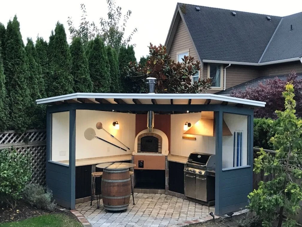
Depending on how much you like to cook and entertain, an outdoor kitchen can be the central hub for hosting summer do’s. We like to encompass the bbq into the design ( much as you would build around a feature stove in your regular kitchen ).

You will need to use weatherproof building materials ( concrete countertops are great ! ) , and will need to create a way to cover the kitchen in the winter months. Caesarstone launched an entire Outdoor line of countertops meant to withstand the elements.

A fun addition might be a pizza oven !

IMG_2971.JPG
outdoor-brick-pizza-oven_wood-fired.jpeg

5. Don’t forget Lighting !

Summer evenings can be so sweet….make sure you can stay outside after the sun goes down with adequate lighting. Adding a ceiling light to the pergola will create great general lighting. A light/ fan combo is great if you want air ciculation. You can also add some outdoor sconces to the house to help light the deck/ yard. Lastly, garden lights help “light the way” to a given path and also create a magical paradise.

solar-garden-lights.jpeg

6. Create a “Tile” Floor/ Pool Deck

Using tile around a pool, this might be common. But now, we are seeing these outdoor tiles being used in all areas of the yard, in lieu of grass. Why? Easy to maintain, and resistant to frost & weather changes. Plus, they look fantastic. (think Baja resort ! ). This Outdoor tile from Centura, “Kingstone”, is 2cm thick and 32” x32” large. They get installed direct onto gravel with a special Schluter levelling system.

IMG_2972 2.JPG

7. Design an Al Fresco Dining Area

Perhaps the most fun of all ! With all the great Outdoor tableware, decor and serving ware exploding at Homesense right now, you can quickly whip up a “fun” dining area. Look at CB2 , Dot, Article & Rove Concepts for great Outdoor Dining tables & Chairs.

IMG_2964 2.JPG

8. Consider the Decorative Value of your Deck

The deck is essentially the “floor” of patio, and a design element in itself. Painting the risers a different colour can look sharp, just like your staircase indoors ! Maybe a charcoal stain is more your vibe. Or an interesting layout for the planks. Composite materials are increasingly weather resistant and require minimal maintenance.

IMG_2968 2.JPG
ipe-deck-boards-1030x579.jpeg

9. Create the Perfect Planterscape

Use these to soften the edges of a patio, or to add privacy. There are many artful planters & to choose from. Check out these from CB2. Play around with height, width & colour to create an interesting visual plant series.

download (29).jpeg

8 Ways to Optimize Space in A Small Bathroom

We see so many homes in Old Toronto that have super tiny bathrooms. When we plan our renovations on these, we work closely with our clients to ensure that every item chosen serves a purpose and maximizes space potential. Read on for a few of our Tricks.


  1. Choose a Wall-Mounted Faucet

Installing a faucet on the wall means more space on the counter, and can therefore allow a larger sink/vanity top. Visually, this also creates a clean, uncluttered look to the sink area.

purist-wall-mounted-bathroom-faucet.jpg

2. Install A Custom Mirror that Spans the Entire Wall

We all know that mirror tricks the mind into thinking there is more space than there actually is. Eliminating frame and detail, the space feels more continual, and not chopped up.

Vostok.jpg

3. Work With Larger Prints

Believe it or not, larger-scale prints create the illusion of a larger space, in contrast to micro/fine prints. Keep this in mind when choosing tile, Shower curtains, or Wallpaper.

bathroom-tile-ideas-sls-smt-0005-657x1024-1571765464.jpg

4. Use A Clear Glass Return Wall for the Shower

Often times there is a small drywall-wall that separates the shower and toilet area. Knock that down and replace with a glass wall, as part of your new custom shower. This keeps better light in the shower, and keeps the space open and harmonized.

frameless-glass-shower-enclosure.jpg

5. Go Vertical !

We may be limited indofar as the footprint of the bathroom, but that only means we need to make good use of the vertical space. Installing a sequence of shelving, with various baskets/ containers, creates more storage solutions ( and looks lovely ! )

30a7f6d164f17577d255ca373cc9dc43.jpg

6. Opt for a Closed Vanity Cabinet

Often small bathrooms get outfitted with small pedestal sinks. Although pretty, they serve little unction. If you look hard, you can find petite vanities that are narrow in width and shallow in depth, and still enable you to store a multitude of toiletries.

Wigington+23.5%22+Single+Bathroom+Vanity.jpg

7. Install Towel Bars on the Back of the Door

Save precious wall-space ,and install towel bars on the back o the bathroom door. You can also have them installed on your custom glass.

bathroo-door-stacked-towel-rails-marble-basket-weave-tile-floor-beadboard.jpg

8. Opt for Potlights

Create a clean visual above by avoiding the temptation to purchase fun chandeliers or ceiling lights. Opt for a simple series of potlights in order to keep the ceiling feeling as high as possible.

M2_Blog_Tagged_product_image__tall_desktop_17_.png

12 Living Room Updates Under $1200

We all feel better when we can tweak our space, just a bit, to feel more “like us”…..

More vibrant, more…..dare we say “Instagram-worthy” ?!

Budgets need not soar, to add a bit of visual interest in the space we all seem to be hanging out in the most.

Here are 12 Ideas Under $1200 to make your central living space just a bit more FANTASTIC! 🖤

 
  1. Add A Statement Chair ( or two )

A bold colour, or dramatic print lands perfectly when done as an accent chair. Buy a new one for $1000-$1200 from shops like Decorium, or score two for the same price, at a Vintage shop.

living-room-ideas-rds-work-queens-road-01-1594233253.jpg

2. Flank with Plants

Surround furniture with plants. For $1200 you can buy yourself a ton of vibrancy/ greenery ! A floor-standing Monstera goes for between $100-$200 /pop. Plantars can run from $20 at Ikea to $200 at CB2.

Bohemian-Living-Room-with-Green-Velvet-Sofa-via-@mrcigar.jpg

3. Create A Gallery Wall

Round up your beloved Digital photos and GET THEM PRINTED ! Add in some fun prints from Society 6 (starting at $25) and get creative ! Purchase a coordinating gallery frame-set from West Elm ( approx $200) or amass an eclectic assortment …….add some patience and a level - et voila ! A Unique gallery wall.

at_image-asset_1.jpeg

4. Paint Out A Brick Fireplace

Perhaps the most dramatic change with the least amount of money. 1 can of paint ($60) and a few hours on a Saturday afternoon. The visual difference between an old red-brick fireplace and a fresh-white one, is incredible !

3cf0dd978efefe13ef0e3a64fe289162.jpg

5. Add Some Sheer Curtains

The gauzy effect of sheer curtains do double-duty - the whimsical feel creates a vibe of effortless luxury…..and the airiness lets in maximal light. Win win. a 30” Panel runs approx $500 from Q Design. So, you can outfit your patio doors for under $1200.

belgian-linen-flax-rod-pocket-sheer-curtain-chambray-c.jpg

6. Do A Pillow Overhaul

Perhaps the easiest ( and most fun ! ) of all the Update-tricks. You can completely change the look of your couch & seating area, by changing up the colour/prints of your pillows. Opt for an assortment of patterns, textures, colours & sizes to up the visual interest of your space. Shops like Tonic Living offer a number of fun pillow options and free shipping !

decor-pillows-for-couch_1024x1024.jpg

7. Commission a Hand-Painted Mural

WHY. NOT. Hire a local artist and get something truly unique ! Provide them with a few inspiring reference images, and then see what they can draft, as a sketch first. Choose a colour palette, and let their creative work begin ! Any artist will charge varyingly, depending on their talent, but you can expect to get something of quality for under $1200, on one wall.

a5bfd36ea04b83b68d60200f5275a1c3.jpg

8. Add A Statement Rug

How different would this room look without the pop of turquoise ? Sometimes an unexpected colour or print on the floor, is all you need to transform a space from basic to vivid. Expect to pay anywhere from $300 (Structube) -$1500 (Benisouk) for a 5x8 rug. Vintage options are also great.

180327-design-interior-ac-632p_45a8c41e1ebaa40779301cb4922ea6a3.jpg

9. Paint One Wall

This will likely fall into a painter’s “minimum charge”, but definitely worth it. Expect to pay around $600 to do a one-colour feature wall. Plus $60 for the paint. Well worth it, for the added visual drama.

Try Benjamin Moore’s Black Beauty.

03-a-Scandinavian-space-done-in-neutrals-and-creamy-shades-and-one-black-wall-for-a-bold-accent-some-boho-touches.jpg

10. Create A Shelf Collection

This metal shelf collection from West Elm runs between $75-$150 / piece. When installed as a “collection” , they provide a beautiful Art-wall ( and are practical - extra storage ! )

shelfmate-collection-black-1-o.jpg

11. Invest in An Oversized Antique Mirror

We don’t need to state the obvious, in terms of the beauty this might add.

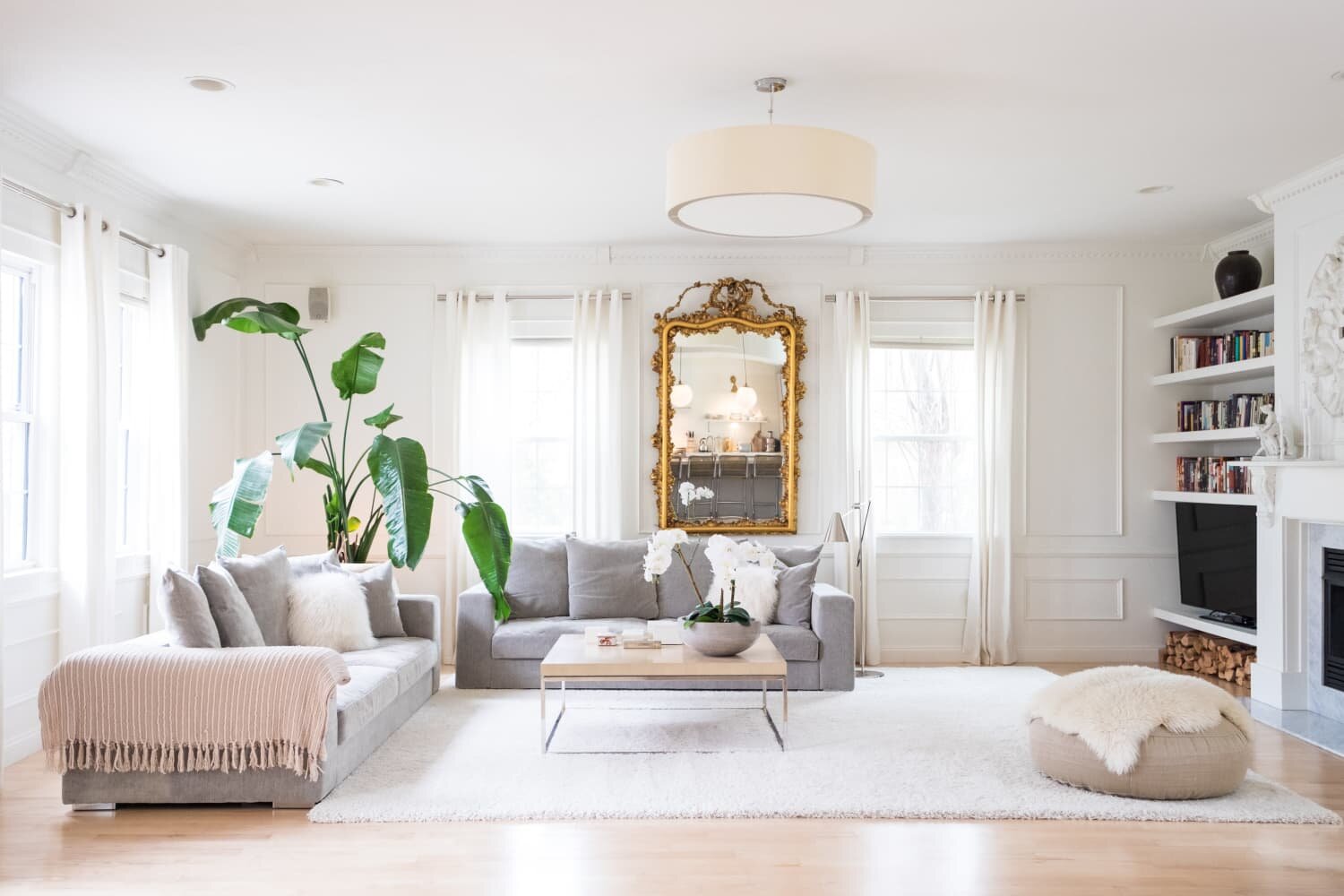
However, worth mentioning, mirrors, of course, create a visual openness for the room. Having a large part of the room reflected through the mirror, adds a dynamic & “grandiose” feel to the space.

project prism_color search archive_f2f148c18271e19e0957d9e47654ebea6e98e7aa.jpeg

12. Update Lighting

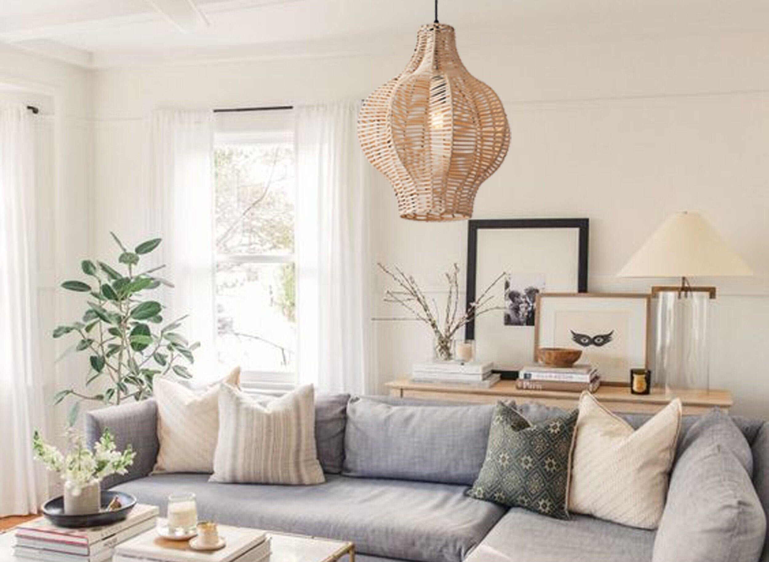
Builder-basic light fixtures make us want to ….scream ! Especially when you can sub-out with such fun ones, at relatively low cost. Try Casa Chic for some Rattan options, Lucent Lightshop for more modern Globe options, and Wayfair for all the rest. Large-scale pendants can be between $200-$1200. Book an electrician to switch out all the main level lighting at one time, to get the most value for his service.

f54491ab396bf913d069d820974d6a28.jpg

All About Nesting | 11 Design Trends to Look Out for in 2021

It’s that time of year !

2020 is Winding Down and we are looking forward to a fresh new year with ( hopefully ) a better vibe.

This year has been all about hunkering down and trying to create our “best-self” Interiors, and we fully expect this to continue in 2021. With many being forced to work from home, more and more people have shifted their focus towards nesting.

Considering people's increased connection to their living spaces, we can't help but get excited about what's on the horizon for Decor, Design & Renovation Trends in 2021.

1. Natural Textures

Anything that feels natural and offers an essential simplicity, reigns dominant in the world of textiles & fabrics. Linens, Soft Cottons, and Wools in neutral tones and soft whites. They make home feel unpolished, relaxed, cozy, and, effortless….like “home”.

1571631011501_SimoneHaagderekswalwell0012copy.jpg

2. Artful Ceiling Lights

We love seeing a resurgence of thoughtful, Crafted Lighting options. Reminiscent of Mid-century themes, including bold colours, interesting shapes, and even floral Tiffanys ( yup!) , aerial views have become more like works of art, alongside their function.

Screen Shot 2020-12-04 at 10.01.39 AM.png

3. Buying Local

As tempting as it is to jump on to mass-seller sites like Wayfair, etc, we all know that isn’t doing anythign to help support our local economy, which is now more important than ever. Not to mention, there is a soul-less, empty feeling in the purchasing experience.
In contrast, the thrill of the hunt, and finding something unique and “just perfect”, never ceases to disappoint.

Guff Furniture Toronto

Guff Furniture Toronto

4. Dried Flowers

Just when you think a Trend will never resurface…..

The early 90’s Cottage / pot-pourri loving trend has nothing on it’s newly restyled counterpart, using Dried flowers to accent Boho & Scandi-themed interiors. Lilacs and pinks have been traded out for more earthy colours and the vibe seems decidedly more relaxed rather than pretty. Stuffed in small and large glass vases stoneware and mason jars, they add just the right amount of heart. And no need to water. ;)

micheile-henderson-XPCdZXncj64-unsplash.jpg

5. Antique Mirrors

More of them. Wherever. Wheenver.

Antique mirrors are finding their way across disparate styles, including Hygge, Traditional, Rustic & Boho Design. We love seeing them show up in multiples, as they act more like art than function.

antique-4783450_1920.jpg

6. Full Spindle Railings

Part 70’s-Inspired (especially when done in wood ) , and part industrial. This trend isn’t surfacing because of it’s safety ( although what a great by-product! ) It has gained notice because of the architectural detail that it brings to a house.

fcbe92412ae0b4dfaf1723c4d6ed8b64.jpg

7. Multi-Functional Spaces

#wfhlife

Need we say more ? People have been reimagining use-cases for all of their rooms, as what we have come to expect from a home has changed. More rooms are serving double-duty and are being intentionally designed to support this.

MFS-Feature.jpg

8. Navy Kitchen

A little colour never hurt anyone. Especially when the colour in question can act as a neutral. Bold-coloured Kitchens continue to pop up, and Navy is among the most popular colour choice. Although somewhat daunting to dedicate to a lavender or the like, navy is a colour that is still “ approachable” to the consumer, and works well with woods and natural elements.

ASS_PROD_IMG_22237543.jpg

9. Statement Pieces in Tandem

Coveting a particular piece of furniture and placing it prominently by understating it’ss urroundings is a common design trick. This year we believe we will see more “layers of interest” -using high-impact pieces working in tandem or in multiples, to create extremely unique spaces.

apartment-1835482_1920.jpg

10. Cottage-Core

What is this style, anhow ?

People have more enthusiasm for the art of baking, gardening, and sewing. With the change of lifestyle, decoration inspiration drawn from the countryside has become more popular; Cottagecore is not idyllic old-fashioned, but a vision of a part of healthy pastoral life, but it is reinterpreted by modern life and should be defined as a romantic interpretation of rural life. Think: heavily printed papers, and the English countryside, but updated.

202010261104231405da291fb94846b358f2a07f2e4ba8.jpg

11. Pink & Green

NO, not the early 90’s pastel combo you might remember ( age?)

A more deliberate, bold, grown-up pairing of these two colours shows up in Jungalow styles already now, and we expect to see more of it continuing in the new year. Somewhat effervescent and “pop-py” we love it’s fun quality.

New-Trends-in-Interior-Decorating-2021-1.jpg

10 Design Mistakes to Avoid

1. Using Furniture Sets

Gone are the days of purchasing full bedroom “suites” or Sofa “sets”. The most interesting way to decorate, involves pulling items from various manufacturers, in various colours, to create a theme instead of a literal “match”. You might consider pieces from disparate styles or from the same style/mode, but with different shapes, colours or fabrics.

curology-6CJg-fOTYs4-unsplash.jpg

2. Matching All Pillows

Similar to the above, there are so many fantastic pilow shapes, textures and fabrics - and absolutely no need to stick with the matching pillows that came with that sofa. Here’s your chance to shine ! And, the best part is, there is no permanence here. Change them up easily - add new ones, move them around to various pieces, or change them seasonaly.

IMG_2616.JPG

3. Bad Lighting

Not every room gets blessed with sunlight cascading in ! In order to get the most out of our Indoor lighting, we need to work in layers. It’s really a combination of potlights for healthy general lighting, pendants for ambiance, table lamps for task work, sconces to highlight, and chandeliers for broader, yet impactful light. Often overlooked as a Design Element, a good lighting plan can greatly affect the “feel” and the functionality of the home.

daniela-Koj7a_Hj2d0-unsplash.jpg

4. Too Many Trinkets

Over time we end up amassing a cumulative collection of heirloom pieces, souvenirs, decor-impulse-purchases and seasonal tchahkis. It behooves us to “stand back” every year and evaluate the purpose each piece serves. Often the sheer volume crowds out the value of each.

Caveat - If you are purposefully curating an Eclectic/Maximalist look, excess decor may actually serve your Design Goals.

stephanie-harvey-OTUahHcqs0Y-unsplash.jpg

5. Under Or Over-sized Furniture

All of you condo-dwellers know the curse of the “fat furniture”. Those huge, luxe pieces that looked great in the showroom, and when brought home, absolutely dominate space. And not in a good way.

Conversely, purchasing diminutive pieces for a larger space can make it seem spartan and really, just “off”.

Keep in mind your room space, adjacent furniture, and walkability when eying new pieces.

chairs-2181947_1280.jpg

6. Placing Furniture Against the Wall

Depending on the size of your room, of course, the Sofa may not NEED to be against a wall, necessarily. As long as the piece is finished nicely, consider bringing them into the space, withe walk-able room behind. This, actually, makes the room look larger.

ralph-ravi-kayden-PPgVACyab0g-unsplash.jpg

7. Avoiding Textures/Layers

Sometimes, when we get into a groove with a certain “theme” we tend to wnat to hold fast to it. The Boho theme has been huge, as of late, but that doesn’t mean that every piece needs to be made of rattan or wicker ! Good design includes layers of textures- a mohair rug, a sequin pillow, a glossy lacquered cabinet, a crystal knob. We can still create harmony through repetition of some textures, but it needs to be in moderation.

megan-markham-AEWIk-r-owI-unsplash.jpg

8. Hanging Curtains Too Low

It’s a common mistake to hang curtains just above the window they are covering. However, much better to hang them as close to the ceiling as possible ( order length accordingly ). This gives the effect of a larger, grander space, and looks more modern.

josh-hemsley-wPYvAFGrL4A-unsplash.jpg

9. Failing to Use Your Outdoor Space

Granted, we don’t live in the tropics. So, we can’t use our patios, decks and balconies year-round.

But, we can definitely get the most out of them in the 2-3 Seasons that are moderate enough in temp. Adding some legitimate lounge furniture, and intentional lighting, can often take this space from ad-hoc to the central area for Get-Togethers. Using this space promotes healthy living, and gives us a nice visual change from the usual living space we tend to congregate it.

IMG_2619.JPG

10. Forgetting Your Personality

You can shove all 9 Thoughts above, in a drawer, if they don’t help you exhibit your own personality, through your home. Rules be darned ! Your space is your own - your haven and your respite. Make sure it reflects what you LOVE, and the pieces you accrue, make your heart SING.

IMG_2656.jpg

5 Quick Tips to Getting Organized

With everyone’ s mind focused on Home improvement ( thank you Covid ), the overwhelm starts upon us, with cries of “ I just want to re-do everything !”

We have heard this over and over during the past few months.

We challenge you this: Consider getting Organized before you head down the path to that large renovation project. “Clutter is nothing more than postponed decisions.” Now is the time to deal with the devil in the details, before moving on to the expensive Design & Renovations.

You’ll feel somewhat lighter, and better able to truly assess the needs of your space.

1. Write Everything Down ( In One Place )

There are so many apps and Journals and Post-its and various other mediums to trap our Notes. We end up with Bills laying around, posts-its with reminders, grocery lists and notes from one family member to another.

You need ONE medium to capture everything.

Things to buy for the House. Groceries. Daily Tasks. Appointments. Family Schedules.

Some people prefer a Good Ol’ Journal and a pen. Others are in Search of the perfect Family Scheduling App. Asana , Trello or Airtable are great Project Management Software options that can help you to organize your Note-taking life, and free your home desktop from clutter.

stil--837JygbCJo-unsplash.jpg

2. Get Your Storage Working for you

Small space or not, every inch of Interior Space is precious.

Properly Organized Vanity or Kitchen Cabinets that work FOR you are key. Pre-set or custom Dividers, Holders, trays, racks and cubbies utilize the space in the most efficient way. This allows more stuff to be stored, AND ensures you can FIND what you need, when you need it !

Suppliers like Richelieu have an extensive line of Interior Organisational systems.

sanibell-bv-BjRpNm_Z9zg-unsplash.jpg

3. Work in a Single Style or Palette

Often we end up buying “chachkies” here, there and everywhere ( after all, it’s the most fun to buy these guys ). We pick them up at Antique Markets, and Homesense, or as Souvenirs. Some are even heirloom pieces.

After a while, the abundance of shape and style creates overwhelm and comes off looking “junky”.

Acquiring Catch-alls, and decor that are (mostly) within a certain colour palette ( blush tones ) or style (art deco ) can help make the space feel more intentional and organized.

stil-6j_x3xGGbaM-unsplash.jpg

4. Sort Your Closet By Season, Then by Colour

This is the quickest way for your ( sleepy ) mind to find the perfect outfit in the morning.

Season first, colour second.

Consider using all the same hangers, for visual appeal, and a comforting effect.

This seemingly Interiors-related tip, serves two purposes - it also “ups” your Fashion game, helping you create outfits you ( most likely ) forgot you owned !

piotr-szulawski-XjR-Y8PKeww-unsplash.jpg

5. Know when to Trade Storage for Style

Sometimes…….

We make the deliberate choice to sacrifice the utility of a cabinet, in the hopes of ramping up our Design Game. And, there’s nothing wrong with that ! Choosing a minimal amount of pieces, useful or purely decorative, to create a “look”, is fantastic. As long as the whole house doesn’t operate like this, you’re just fine!

scd-black-chalk-style-paint-erin-20190205-keepsakes-redefined-hutch-black-pepper-chalk-style-paint-general-finishes.jpg

8 Considerations of a High/Low Renovation

We know there are ways to save money , and certainly ways to spend (tons) on a Home Renovation.

But - WHERE to save and where to spend ?

We explore 8 fundamental areas of a home renovation, that have valuable spend/save options. These are the fundamental “bones” , or structural elements of the home, not the decor.

  1. Fireplace | Paint vs Re-build

Purchasing an older home, with a fireplace that is quite “dated” poses a bit of a design challenge. We often see old hearths with ugly orange gloss tiles, paired with brass fireplace inserts. (oh boy !)

The high-end resolve is to demolish entirely and build out an entirely new Fireplace wall.

However, the cost-saving( and arguably artistic ) solution is to paint out what is currently there. Brick especially paints nicely in a solid white or black. The actual fireplace itself can be sprayed a deep matte black. Then, add a contemporary floating mantle.

DONE.

Image: Katie Lamb

Image: Katie Lamb

2. Doors | Solid vs Hollow-core

With the popularity of the Open-plan, Often there aren’t a huge number of doors in a home. We argue that, that being said, you might want to splurge on the pleasure of a heavy door. There is a special luxury found here, doubly so if you choose one with a unique design.

The cost differential can be over double, however.

Image: Metrie

Image: Metrie

3. Hardware | Designer vs Box-Store

This is an area where we like to suggest a bit of savings. There are so many mass-made options that yield a similar look to their designer counterparts.

Left: Buster & Punch. Right : Wayfair.

image: buster & punch

image: buster & punch

IMage: wayfair

IMage: wayfair

4. Kitchens | Re-Spray vs Remodel

This is a huge decision with a large financial implication. You could re-spray your old “oak-ey” ( and ugly ! ) cabinets with a matte black or white or grey, and get a fantastic updated result, almost overnight. Or, opt for a unique colour and have some fun. A trendy colour will help diminish the impact of the outdated door style or cabinet design. A typical suburban home might cost you less than $10000.
Alternately, an entire Kitchen renovation could easily have you over $50000.

The kitchen is arguably the “heart of the home” and the area that people often get excited to design as their own. However, your choice to spend or save here might implicate the extent to which you can renovate other areas of the house, insofar as how far your budget can strech.

header-image.jpg

5. Floors | Hardwood vs LVT

All the Home Fashion Blogs are filled with shiny renovations featuring lux hardwood floors throughout. Engineered, wide-plank woods - Maples, Exotics, Wirescraped Oaks, can run as high as $15/ sq foot depending on the brand and the finish.

A less expensive option on the market, is LVT ( Luxury Vinyl Tile ) . Usually in the neighbourhood of $4-$6 sf, with print options to resemble hardwood. Mannington’s LVT looks just like the real thing, pictured below.

Although Re-sale value still dictates that hardwood itself is the most coveted option, bear in mind all options when designing your budget.

IMG_7712.JPG

6. Baseboard | Wood Vs MDF

If you can do it, real wood baseboards can create a luxe feel for the entire house. Along with the floor, this is the one consistent element that defines the home.

However, similar designs can be achieved using painted mdf. We recommend using large-scale sizes, and stacking multiple pieces to create visual interest,

The cost differential between the two, can be over double.

wainscott-moulding.jpg

7. Stairs | Refinishing vs Replacing

Modern railing choices include the use of metal ballusters, glass and often simple, clean lines.

While removing and replacing might not be in the budget, you can update the look easily by painting out the bannister and spindles in a deep black. Refinish stairs to match the colour of your hardwood floors, and voila - instantly updated.

IMG_7715.JPG
IMG_7713.JPG

8. Closet Doors | Decorative vs Flat-panel

Using the opportunity to add visual interest in the architectural details of the house, often pays back ten-fold. There is intentionality that goes with building design elements into basic structural components. Homes that have lovely details like this, read as “curated” or “personalized” - one more step in transforming a house into a home. With often minimal financial difference, try making a more unique choice on closet doors and finishing with pretty casing & architrave.

IMG_7709.JPG

10 Home Renovation Projects for the "After" - and How to Plan for them Now

Everyone is “hunkering down” at home, staying safe, adjusting to the new Indoor-normal.

And some of us are faced with, perhaps, a little extra time on our hands?

Quite possibly that spare bedroom full of boxes and junk, that never bothered us previously, is now screaming , “time to fix me up !!!!”.

Or, spending so much time looking at that dreary wall colour, has you thinking - time for a change?

And that home office space you were going to create - well —- now that is really top of mind, isn’t it ?

At some point, when this pandemic lifts, and life resumes, we are going to want to move ahead with some of the projects we have had in the queue ( arguably, with much fervor ! ) And now - in the quiet time, we have a chance to plan these projects out !

There is much we can accomplish, all in the comfort of our fuzzy slippers !


1. Plan that Gallery Wall

Now is the perfect time. Get out the few pictures you finally got around to developing, of the kids. Go online and look for interesting Art & Photos from Gig-based platforms like Society6. Consider adding in mirrors, heirloom pieces or decor. or Order Frames & Frame Hooks on Amazon or Deserres. Once all your choices are made, get out that measuring tape and plan your attack. Lay out your prospective gallery on the floor first.

GalleryWall_01.jpg

2. Go through the House and do a “Hardware Overhaul”.

It is amazing, the transformation, that can be made when you change your hardware. On your kitchen cabinets. On your bathroom cabinets. On your interior doors. Even on Furniture pieces like dressers and sideboards. Go through your house and make a list of all the hardware you want to change. Jump online, and look at manufacturers like CB2, Richelieu and Emtek, and start creating shopping carts. Some businesses are still shipping, and you may be able to get your items shortly and begin installing.

Cropped_Best_White_Paint_Gallery_9.jpg
download.jpeg
download (1).jpeg

3. Plan to recover vintage or tired furniture pieces, to give them new life.

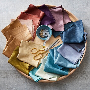
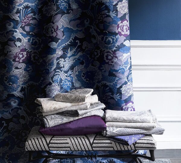
Reupholstering existing pieces, can be so much fun ! Find a designer and have them send you fabric swatches. ( Our design arm, “Sunday Creative” is a great resource - contact her @sabrina@sunday-creative.com ) Many of the fabric mills are still sending swatches. Order a variety of textures and prints. Once they come in the mail, drape them over the prospective pieces and see what you think !

ink-lp-img.jpg
RA_Collections1.jpg
bh-ink-2_1.jpg

4. Plan & Order an “Amazon Patio”

We are surely busting at the seams right now, anxious to be outside again. We don’t know how long this will last, so let’s create an outdoor patio environment that celebrates the coming of spring, and allows us to be outside, even if it is just our own backyard.

Start with the basics if you don’t have them - seating & tables. Then, make a list of cute and cozy things that will make your safe-haven patio even sweeter - twinkly lights, colourful accent cushions, bright dishware, tiki lamps& fun outdoor carpets.

Amazon seems to be in full-swing, still. Let’s take advantage of this.

TorontoHOME-Ivy-Exterior-2014-copy1.jpg

5. Start thinking about some Creative Cabinetry Solutions

If you are looking around, like us, and seeing just how much “stuff” we have in every room of the house……Kid’s toys, gift wrapping supplies, board games & media…….Let’s take a second to consider Custom Cabinetry to hide some of this “stuff”.

Find a local cabinetry shop ( shopping local during this time, is oh-so-helpful to small business that count on our patronage ), and email them to ask for quotes on custom cabinets. Be prepared to send them photos and dimension of your room. They may be able to even send you samples, and get you order in production, during this time, and then delivered in the “after”.

creative cabinetry.jpeg

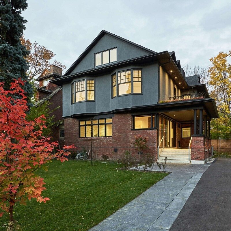
6. Do a “Drive-by” in your neighbourhood and scout Home Exteriors for Ideas.

If you are considering an exterior face-lift for the house, jump in the car, and do a Home Tour in your area. Take photos or make notes of how other people have used Colour combos in their exterior — whether it be Paint for Siding, Window frames, Door Colours, Eavestrough paint, Shingle colours, or landscaping choices.

Make a Concept board for yourself, logging all the images that might work together for your house, and you will be all set to start fetching quotes, once renovation work resumes.

before-after-new-addition-edwardian-home-toronto-11677-9579385.jpg

7. Get the Kitchen organized.

A lot of us are making an inordinate amount of meals at home now, and perhaps you have noticed just how inefficient your setup is. Let’s go through your kitchen cabinets, one by one and see what is working and what isn’t. In the quiet time, let’s double-down on organization and plan a more well-thought out Kitchen space. Brands like Richelieu, have everything you need to create an organized Kitchen Interior. Jump online and start a cart.

A place for everything, and everything in its place.

2-tier-kitchen-cabinet-pull-out-drawer.jpg

8. Make Your Design Plans “real” by Drafting an Online Spreadsheet

Capture all your Design & renovation “hopefuls” and lay out a budget with an Online software system.

We love and use Airtable almost exclusively to plan our projects. It is a robust FREE program, with unlimited organizational abilities. Set up your “base” with columns and data-sets of your choice. Create completely custom, or work off of existing templates. Easier to read and format, than Excel. Add links to loved products. Include prices, Sources, images, dimensions and more.

Screen Shot 2020-03-26 at 2.32.02 PM.png

9. Reach out to a Local ( or, not so-local ) Designer and book a Zoom Consultation.

Book a 1-hour Zoom chat with a Designer and have them assess your visually. Ask them to give you a “prescription” afterward. After a discussion, getting to know you & your needs & budget, your designer should be able to provide a Digital Concept board to you, with Product Ideas. Ask for a Shopping List to go with this, and be all ready for when the stores re-open.
Again, Sunday Creative is providing this service in two ways - $95 for a 1-hour Zoom Call, or $300 for a 1-Hour-Zoom call with Concept Board & Shopping List. ( Based on 1 room ) .

image0 (3).jpeg

10. Get Your Colours Done ( Love this Old-School phrase ! )

Reach out to a Designer and book a chat to start creating a Paint plan for one room, or for the entire house. Brands like Benjamin Moore and Farrow & Ball are still shipping samples. Load up on samples, pin them to the walls, and have the family weigh in on options. Getting a professional Colour Board “done” helps clarify the overall feel of the house, and will take into account the colours for ALL things - walls, ceilings, doors, exteriors, trim work, architectural mouldings, and even soft-furnishings.

living+room+palette.001+(4).jpeg

Find this Blogpost helpful ?

We would love it, if you Shared with friends !

14 Tips Setting up the Ultimate Guest Suite | For Airbnb or Family & Friends

Design & Setup Ideas That Will Transform Your Spare Room into A Mini-Retreat for Guests.

With Soaring Home prices, and Travel Culture abundant, you might be considering turning your spare room into an Airbnb Guest Suite. This one little room can be a huge income offset, bringing in extra money to the tune of tens of thousands, over the course of a year. In addition, if you are open-minded and a traveler yourself, you might just love the idea of meeting new people from all over the world.

But perhaps, that’s not your motivation for sprucing up the Guest Room. Perhaps, you have a large contingent of out-of-town friends and family that stay over often and you are anxious to up your hosting game.

Either way, these Tips will help you create the perfect Guest Sanctuary.

guest suite 5.jpeg
  1. Load Up on Luxury Linens

    Nothing makes a more inviting stay, or a more lasting impression on a Guest, than cozy, smooth sheets, a fluffy duvet, lots of layers for choice. We love White, white, white. It feels the freshest and can be easily bleached.

guest suite 14.jpg

2. Add Fresh Flowers

Bringing in Fresh Flowers ( simple arrangements, at the bedside or desk-top ) remind your guest that this room is vibrant, and part of your home - not a lost cause, back-of-the-house cave that no one enters. And, of course, there is the beautiful smell !

guest suite 6.png

3. Get An Oversized Reading Chair

Providing a spot for guests to relax, read, check their phone, or watch tv, that isn’t the bed, transforms your space from guest “room” to guest “suite” , giving your guest the extra seating option.

4. Curate A Small Book Collection

Giving your guest some reading material, especially a few books that resonate with you personally, gives them the feeling of community and a small element of surprise and consideration.

5. Towel, Towels, Towels

Towels cannot be too abundant, too lush, or too well-folded. Load up on plain white towels from Homesense and Stack ‘em up high ! Guests will be grateful that they won’t need to ask you for extras.

guest suite 2.jpeg
guest suite 9.jpg

6. Buy Some Travel-size Essentials

This is definitely “above'-and-beyond”, but for $15, you can make a stellar impression on your guests, leaving them with the feeling that you have them covered ! Most likely guests will only use an item or two, and you will have the rest for the next guest anyways !

1400970167570.jpeg

7. Create A Small Desk Area

This doesn’t need to be big - a small desk, even 30”, does the trick. Guests love a spot to open their laptop, put on makeup or write notes. Top it off with a magnifying mirror, and a stationary set

8. Write a WiFI Note

The first question from any Guest ( most specifically Airbnber’s ) is …”What’s the Wifi password? “ We can’t live without being connected - immediately! LOL. So, let’s create a little Wifi Card with Network & password on there, so they can connect all their devices at their leisure.

9. Provide a Spot for Their Luggage

Save people from bending down, to unpack from the floor, or the dirty suitcase from hitting the bed. A $29 folding luggage rack is that small hotelier touch that makes all the difference.

guest suite 3.jpg
guest suite 4.jpeg
guest suite 10.jpg

10. Install Heavy Blinds

A good night’s sleep is best achieved in total darkness. Make sure your room gets cozy & dark by installing heavy blinds. Consider adding a sheer option for choice.

11. Make Sure There is A Locked Door

Sounds so obvious, but since this is a room in your house, and you are so comfortable there, you forget that guests may feel MOSt comfortable with an assured private space. Replace your passage handle with a privacy one. Use the opportunity to make it a pretty one !

Emtek Hardware

Emtek Hardware

12. Make Sure There is At Least 1 Mirror

Make sure there is at least one mirror in the room, even if it is small. This ensures your guests can check themselves without having to go into the bathroom, which may be shared with you and your family.
13. Store Heaters/Fans

Invest in a small, portable fan and space heater, and let your guests use it if they feel the need. Store them in a closet inside the room.

14. Coffee, Tea & Treats

Depending on your budget, a little snack station goes a long way. Invest in a small Keurig & Teapot and create a small beverage basket ( you can put this on the desk ) . This, again, gives your guests autonomy and privacy in indulging in simple pleasures like a morning coffee.

guest suite 13.jpg

If you are looking to build an additional bedroom room or renovate an existing one, Give us a Call. We can help you revive your space and get it ready for you to Up-level your Hosting Game !

2020 Home Design Trends to Look Out For | A Much Needed Divergence from the Basics

We have been Flooded by Imagery on Social and the like, of Over-Exposed Photos showing White Design - layers and layers of White from cabinetry to Flooring & Walls, to Decor. This, along with Simple Materials, Clean Lines and Minimal Decor Elements. 2020, by contrast, looks to be offering a resurgence of Colour, Texture, Customization, and Bespoke Living. Here are some Interesting Trends to look out for, as the New Year rings through, and we look at re-defining our Selves, our Homes, and the Way We Live.

  1. Pink - Everywhere

We’ve been seeing Pink ( albeit mostly pale, blush tones ) pop up everywhere. Namely, in Cabinetry. How fun ! Not totally unexpected, seeing how Benjamin Moore’s Paint Colour of the Year is First Light, which is a Warm Rosy Pink, itself.

Superfronts, UK

Superfronts, UK

Hanna Tveite For THE LINE

Hanna Tveite For THE LINE

Florim Ceramiche Porcelain Wall Slabs

Florim Ceramiche Porcelain Wall Slabs

2. Unexpected Fixture Colours

Kohler, our Go-To Plumbing Brand, has always had an inventive, bold lineup of colours in it’s arsenal. They always seemed to be reserved for the daring, however they are making their way to the mainstream - especially Black, and deep hues like this Plum.

Kohler Artifacts Tub in Plum

Kohler Artifacts Tub in Plum

3. Architectural Doors & Panel Walls

Relying on Decor to create pops of Interest is fine…but weaving Stunning Visuals into your home from an Architectural standpoint, is far more luxurious. panel walls add dimension, beauty & warmth , and can also be used to delineate areas in an open-concept plan. Detailed doors with Carved Design, or Applied Mouldings can bring an otherwise simple space and elevate it, especially when used consistently, throughout the home.

Beadboard Panel Walls

Beadboard Panel Walls

Metrie Fashion Forward Door

Metrie Fashion Forward Door

Panel Wall by Love Create Celebrate

Panel Wall by Love Create Celebrate

4. Semi-precious Stone as Tile

The Artistic Allure of Jewel surfaces brings the “stone” look up a few notches - to designer heaven. Even Neutral colours can be stunning in their design- saturated tones & irregular patterning, combined with the warmth and familiarity of nature.

“Les Bijoux De Rex” Porcelain tile by Florim Ceramiche

“Les Bijoux De Rex” Porcelain tile by Florim Ceramiche

5. Latch Hardware

We’ve seen the long tubular handles ad infinatum and we are so grateful to get on board with a more understated, Vintage-inspired look. The cabinet Latch hardware functions as a twist mechanism, releasing the through-latch as you turn. ( Great for baby-proofing ! ) Available in finishes like Burnished Gold, Copper, Matte Black, Oil Rubbed Bronze, and Polished Nickel.

Vintage Inspired latches on Navy Shaker Cabinets

Vintage Inspired latches on Navy Shaker Cabinets

Emtek Brass latch

Emtek Brass latch

6. Porcelain Slab-Walls

On the market for some time now, Large Porcelain slabs have been used to create visual drama on the walls, mostly in stone-inspired looks. Here, Florim Ceramiche has a Simple Line of colour-Block Porcelain Slabs, that can be used alone or in colour combinations, to provide an architecturally -detailed alternate solution to paint. Available in 6 pastel colours, bringing to mind the soft, colourful style of the 1950’s.

Florim Ceramiche “Crayons” Porcelain Colour-Block Wall Slabs

Florim Ceramiche “Crayons” Porcelain Colour-Block Wall Slabs

7. Blown Glass Lights

Artisan products are a hit with our culture right now, as we values authenticity, creativity and local good.s. Millennials flock to artisan websites like Etsy, an e-commerce portal focused on handmade, vintage and craft items. Hand-made Blown-Glass Sculpture as Lighting, fits right into this model. Lighting becomes small (or incredibly large !) works of art in the home. AM Studio in Toronto offers Unique pieces in their lineup and Bespoke work as well.

AM Studio Lens Hanging Light

AM Studio Lens Hanging Light

AM Studio Soap Pendant Hanging Light

AM Studio Soap Pendant Hanging Light

8. Metal Railings

Industrially-inspired, metal railings add a modern element to the space, and play well with open-concept floor-plans. Beyond the typical vertical or horizontal balusters, these pieces can be sources of high visual impact, hand-crafted in unique, artful designs.

Screen Shot 2019-12-29 at 8.46.50 AM.png
stringio.jpg

9. Caning

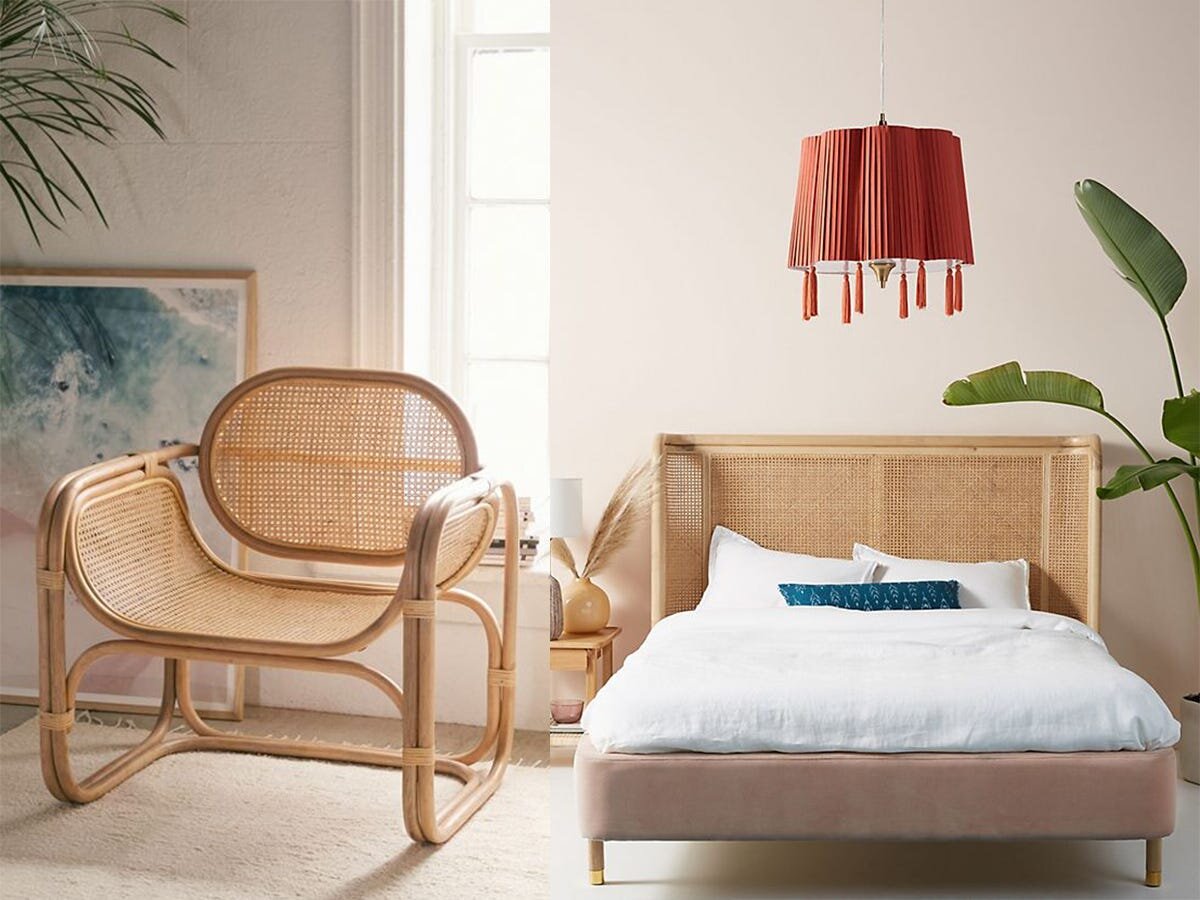
This year, it’s all about caning—that open-weave, graphic treatment of rattan that you probably recognize from 19th-century antique settees or midcentury-modern dining chairs. We are seeing Lovely Caned options as Headboards, Chairs, Coffee-tables, Rocking Chairs, Dining Chairs, Sideboards & Dressers.

Urban Outfitters Chair; Anthropologie Headboard

Urban Outfitters Chair; Anthropologie Headboard

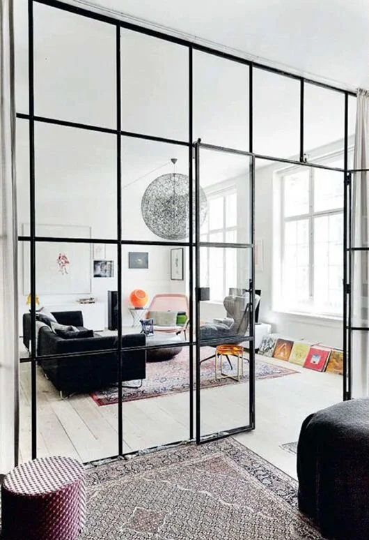
10. Glass Divider Walls

Sometimes an Open-Plan needs a “break”. Industrial-framed glass can provide the illusion of distinction and the feel of harmony, all at the same time.

FIxed Divider Wall

FIxed Divider Wall

Divider wall with Hinged Double Door

Divider wall with Hinged Double Door

A Family That Works Together Stays Together - The Benefits of Building a Family Home Office

Don’t Sacrifice Family Time for Work Time

With a space built for not only yourself but your spouse and children to work on on business, bills, homework, hobbies and art means work at home can be a shared experience, and more time together is never a bad thing.

family_office_shared_living_room_craft_art_room_005.jpg

Motivate and Inspire Each Other

Seeing others work encourages you to get started and to keep going. Discussing your projects in progress can spark ideas for 'other family members’ projects. Sometimes even the most dissimilar project can become relevant in some small way.

1492042961256.jpeg

Editors-In-Training

Sometimes a pair of fresh eyes is what is most needed. Having people around to ask quick questions, bounce ideas off of or solicit quick proofreads from can help you polish and improve your work.

Setting an Example

When your kids see you working and focusing, it can encourage them to complete their homework. Kids are always watching, even you think they’re not; they are absorbing your habits. If they see that you value hard work they will value it as well.

family office 2`.jpg
family home office.jpg

What To Include

A HIGH TOP TABLE - This makes for a great desk to use both with bar-hight chairs or stools, or as a standing desk. Standing can improve circulation and alertness, and is generally better for your health than sitting. You can alternate between standing and sitting, or stand at the desk to complete quick tasks without a chair to pull you in for longer than is required.

LOTS OF STORAGE !! Storage for your kids’ stuff, storage for yours and your spouse’s stuff, office supplies, art supplies, printer supplies; everything you need should be right there, this way there’s no excuses for getting things done. Having everything organized and at your fingertips prevents procrastination. You can also consider not putting everything away. Leaving out the items used most often can encourage you to work on your project. Getting out all your materials can become just another excuse to justify putting off getting to work.

sotrage.jpg

HEADPHONES - Even though working together is nice, sometimes outside noises can become distracting. Together in silence is still together. Sometimes one member needs to watch a video or listen to to an audio file but does not want to disturb the others. Headphones are a great way to work side by side without breaking each others’ concentration.

WINDOWS - The sun can be invigorating, keeping you energized and alert while working while also providing light.

What Not to Include

A TV! - TV’s are distracting and aren’t required to get down to business!

small+family+home+office.jpeg
p_101067578.jpg

A Family office is more than just a space, it is a lifestyle; supporting and encouraging each other as a unit. It means getting more done and spending more time together.


Railings without Barriers

Railings without barriers - barriers to design that is. The often underappreciated, understated deck railing dos not have to go unnoticed. Vertical wood beams are not your only option. Here are a few alternatives

Garden Wall

lanscape+retaining+wall+2.jpg

Use a landscape retaining wall as your deck’s railing. A Thick wall filled with dirt to expnds your garden space and provides beautiful decor for your deck.

Tree Branches

tree branch 7.jpeg

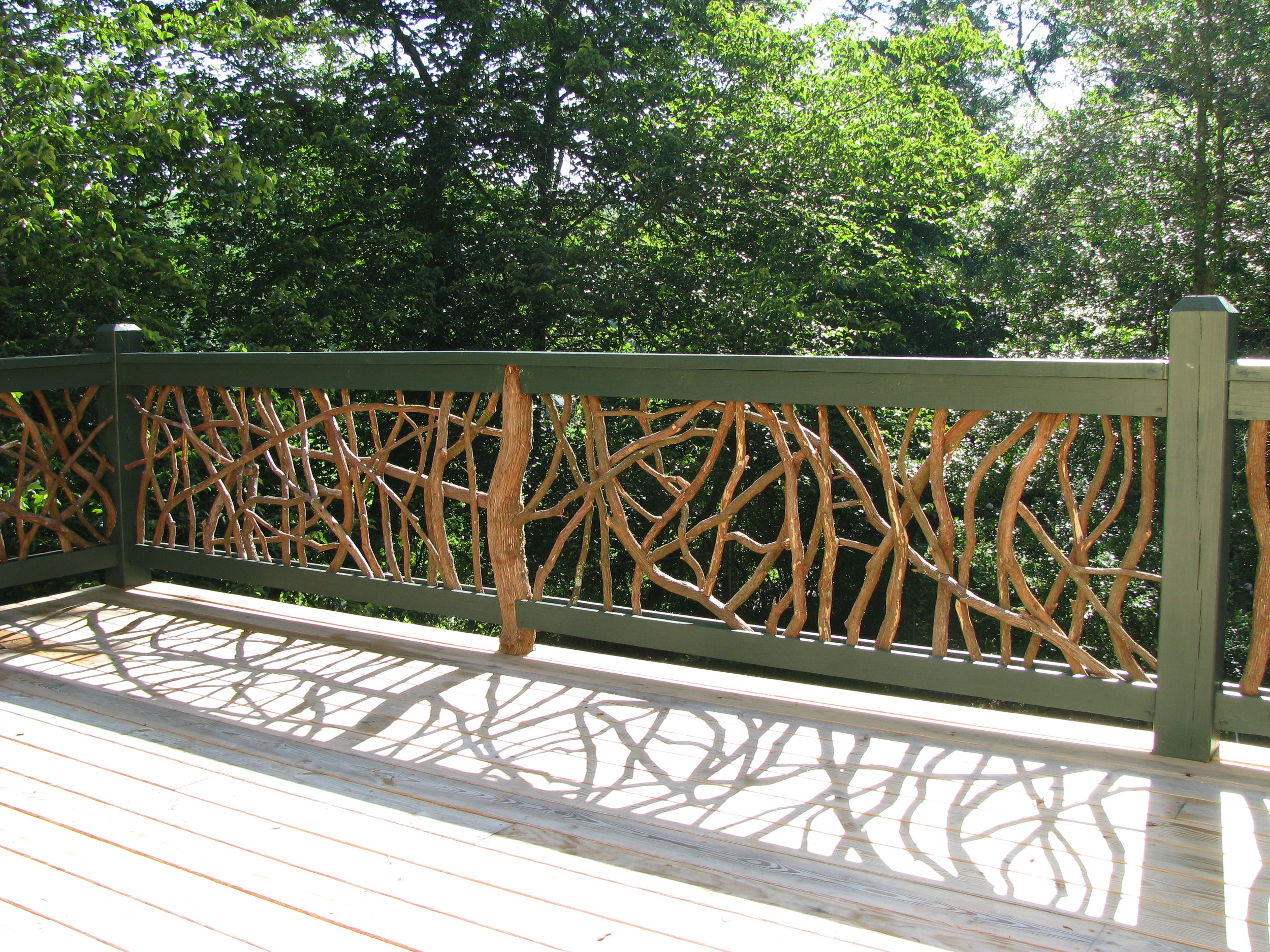
Use found tree branches as spindles, or even in the construction of your entire railing to create a sense of variation. It compliments our biophilia; that innate tendency to connect with nature by creating a fluidity between what is man-made and what is natural.

Privacy Screen

lattice.jpg

Adding a privacy screen to the top of your railing, or continuing all the way to the deck floor not only provides privacy but a place for vines and flowers to grow, and twinkle lights to be hung. It also lends to other design possibilities such as hanging decor, and the light reflections created by the shape of the negative space. Horizontal slats, vertical slats, lattice pattens and other wood designs, as well as metal are available for creating a unique privacy wall.

Bar Rail

bar rail 2.jpg

Add some functionality to your railing by transforming it into a bar rail to enjoy burgers and beers on the deck. It also provides an opportunity to select stools to contribute to your aesthetic.

Sunburst & Criss-Cross

cross+cross.jpg
sunburst 4.jpg

There are endless wood patterns that can be created with the spindles of your deck. The farm-like criss-cross pattern can often be found on the decks of beach houses but can, of course, be used on any deck. The sunburst design is bright and cheery. It breaks away from the rigidity of horizontal or vertical lines allowing for a sophisitcated playfulness.

Bench

bench flower boxes.jpg
bench.jpg

Use flat, horizontal slats to create a backrest for a built-in bench. You can also create a backless bench with built-in flower boxes as your posts. A bench creates additional seating, extra space and provides design opportunities for pillows and throws and other decor.

Glass

glass.jpeg

Glass, or plexiglass, provides the greatest view, undisrupted by spindles and designs. You can also get an opaque or tinted glass which lets in light but allows for more privacy while also preventing birds from accidents with birds flying into glear glass. If you are using glass rather than plexiglass, be sure to select tempered, shatterproof safety glass.

Metal

aluminum.jpg

Rock on! Powder-coated aluminum is rust proof and incredibly easy to maintain. It is available in a number of colours and designs.

Cable

cable 1.jpg

Cable railings, like glass, make for excellent views. They often contribute to a modern aesthetic.

Chippendale & Craftsman Styles

chippendale.jpg
craftsman.jpg

More wood designs! The list could go on forever, but these are just another couple common wood railing designs. The chippendale design is on the left, creating amazing light patterns and energizing effect. The craftsman design is on the right, adding interest but remains calm and conservative.


Green with Sustainability Envy

sustainability 3.jpg

Incorporating sustainable principles into your home’s design has become increasingly important to consumers. Taking care of our planet is just as important as taking care of ourselves and our homes. Homeowners aim to design using products that reduce energy, pollution and waste without compromising on functionality or aesthetics

Energy Efficiency

energy efficient.jpg

Homes with high energy efficiency are not only good for your wallet, but help to reduce greenhouse gasses and conserve resources.

Using high quality insulated windows and doors can help regulate the rooms temperature without letting in unwanted cold and heat. The same is true for quality curtains. They make a surprising contribution to not only keeping light out, but heat from the sun as well. They also help to prevent heat from escaping during the winter.

The use of alternative heating, such as underfloor heating can be used to heat a room in a way that is often more energy efficient than other heating systems. The use of solar panels, unlike power plants, produce energy without any waste or emissions.

Smart homes are another great way to precisely control your home’s temperature and lights to ensure only what is required is on and in use. This ease of use and precision prevents wasted energy.

Choosing Materials with Low Environmental Impact

upcycle 2.jpg

When selecting materials for building during your homes renovations, or looking at the materials of items you purchase, materials from renewable resources, such as bamboo help prevent the depletion of non-renewables. But it is not just the materials themselves but how they are exrtacted, the process through which which they are manufactured, packaged and shipped. The FAC label found on wood, for example, is used to identify wood that has been harvested with little impact to the environment.

Local items require less transportation which reduces, for example, vehicle emissions. Handmade items, unlike those manufactured in a factory, do not affect the environment in the process of their construction. With the ubiquity of the internet and social media, it is easier than ever to get our hands on handmade items and local businesses and craftspeople in the process.

Upcycling

upcycle 4.jpg

Upcycling is a modern day term for what our grandparents called recycling. The idea is that if something goes out of fashion, or is about to be thrown out, we can not only give it a new life, but a better one. Recover your sofa, paint or stain a piece of furniture, add new hardware to your cupboards, turn an old chest into a coffee table. You can upcycle your own items, or purchase items that have been upcycled by somebody else. There are also a number of products made completely from recycled materials. Wth the emergence of trends such as ecclecticism, maximalism, and a growing number of other design trends that pull inspiration from the past, someone else’s junk can become your beautifully antique feature piece.

Durability

durable.jpg

Choose durable items that will withstand the intensity and messiness of everyday life in order to prevent waste. Consider the lifespan of your materials and choose quality over quantity. Design your space with easy maintenance; if it’s easy to maintain, it is less likely to be neglected and will last longer.

Air Quality

natural light 4.jpg

Our personal environment, inside our home, is just as important as the earth’s environment as a whole. It is all one in the same. The quality of air, heating, ventilation, lighting and acoustics should all be considered as they can all affect our health, negatively or positively. it’s not only outdoors and in cities where this pollution collects and is created. There is such a thing as indoor air pollution as well. It is caused by products with high levels of toxic emissions. Items treated with harmful chemicals can release those toxins into the air. To determine this, look for items with low VOC (Volatile Organic Compounds) when selecting materials. Proper circulation keeps the air fresh, as well as oxygen-producing plants. Natural light exposure is also important for mental and physical well being and should also be considered when designing a space.


I never thought to do that...

We "Sais" the "Je ne sais quoi" that gives a home its spark. Here’s a few less than obvious trends you may not have thought of.

Double Trouble Islands

double island.JPG

This functional and beautiful use of two kitchen islands is displayed in this kitchen from our recent project in Aurora. It provides extra storage, seating and counter space, & makes use of the generous kitchen layout.

A Touch of Wallpaper

a touch of wallpaper.png

Patterns and bold design are often found in pillows, throws and rugs but often neglected on our walls. Inject a little extra interest with a wallpaper piece, used as a feature wall, to fill a niche, or an entire room. Even your washer and dryer should have a little pizazz.

All Brass All the Time

brass.jpg

Chrome and brushed nickel are not the only finishes. Brass, especially, is an elegant way to feature your piping and plumbing.

Moulding Walls

wall panelling.jpg

Wall mouldings bring three-dimensional texture and depth to something as vast and plain as your walls. It’s a subtle, yet creative way to transform a wall into a low-relief sculpture.

Mix it Up - Fabrics & Textures

mixed fabrics_textures.jpg

A collage of textures and fabrics bring life to your sofa and chairs. Sometimes the details can bring a room together and make it feel like home. Mix leathers, velvets, furs, rattan, canvas & cotton for a more dimensioned look.

Shiplap Walls

shiplap.png

Shiplap panels are peel and stick planks with a real wood veneer for a wood-look textured wall that’s easy to clean. Available in a variety of colours and appearances, such as a more notched and grainy rustic wood or a smoother white wood as pictured here. A simple way to create an excellent feature wall in any room, including the bathroom! We love the Wallplanks brand.

Industrial Sliders

industrial sliders.jpg

Inside outside, outside inside. These industrial sliders are more than sliding doors. They disappear into the wall, or fold for a dramatic entrance / exit to your room. With a black frame and grid, its industrial design turns a door into a bold art piece.

Colour of the Year

colour of year.jpg

Benjamin Moore’s colour of the year, Metropolitan AF-690 is a cool grey. It’s neutrality is a great canvas for some of the other bolder choices listed here.
Flat Finish Paint

estate emulsion.jpg

It’s not just the paint colour to be considered, but the paint finish. “Flat”, which is an ultra matte finish, is a minor, yet modern “finish” to the room. No one does flat better than Farrow & Ball, with their Estate Emulsions finish, featured above.

Slab Porcelain Walls

porcelain slab.jpg

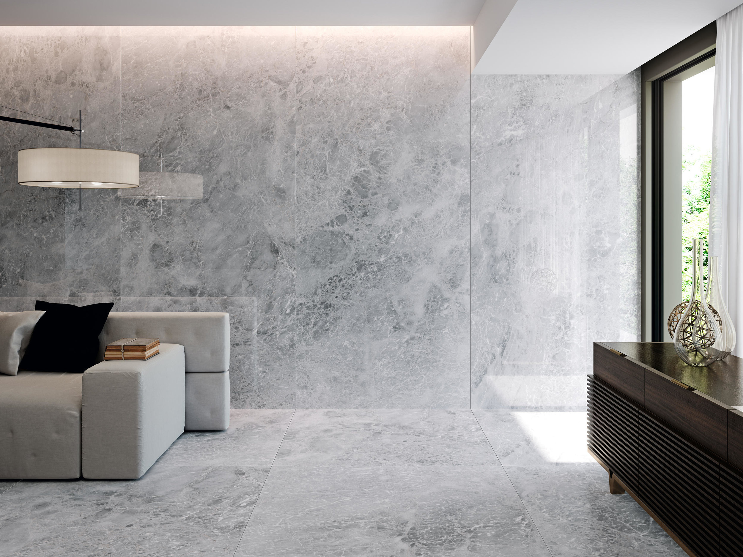
Tiles have been increasing in size, but they have gone beyond the usual tile sizes to a large slab for a grand and luxurious appearance with minimal grout lines. For feature walls, showers, fireplaces & more.

The above ideas you might not have thought of, but will bring that extra piece of finish and style to your home.

But now…..you’ve thought of them.

Sink Your Teeth In

Kohler Artist Adition sink in Imperial Blue

Kohler Artist Adition sink in Imperial Blue

Bathroom sinks are often overlooked when envisioning the design of your space due to their assumed boring and generic nature. But this should not be so! There is amazing variety, personality and style that can be found in the shapes, colours and materials used to create insta-worthy bathroom sinks.

Texture

Kohler Derring sink

Kohler Derring sink

Subtle and elegant textures added to the surface the sink bring intrigue and a sense of quality to the sink. Try white on white for something more subdued , or the high contrast of a bolder colour such as above.

Derring pattern

Derring pattern

Sartorial Pattern

Sartorial Pattern

Copper

Copper

Copper

Copper is a bold and colourful natural material that makes for a fantastic statement sink. Available in a shiny finish to bring some glam to your bathroom, or a more serious and masculine antique copper as shown below in this unique rectangular drop-in sink.

Antique Copper

Antique Copper

Tempered Copper

Tempered Copper

Tempered copper, especially in a vessel installation type, is rustic, earthy, and natural. It pairs great with a reclaimed vanity as shown above.

Artist Edition

Kohler Caravan Persia Artist Edition sink

Kohler Caravan Persia Artist Edition sink

Artist Edition sinks are a beautiful amalgamation of aesthetics and practicality. Companies such as Kohler, have collaborated with painters, photographers and artist to bring unique patterns and designs to their bathroom sinks. These sinks are a work of art and can become the focal point of your bathroom’s design.

Kohler Dutchmaster Artist Edition sink

Kohler Dutchmaster Artist Edition sink

This pattern comes from the “florography” (Floral photography) of artist Ashley Woodson Bailey.

Nickel

polished nickel sink.jpg

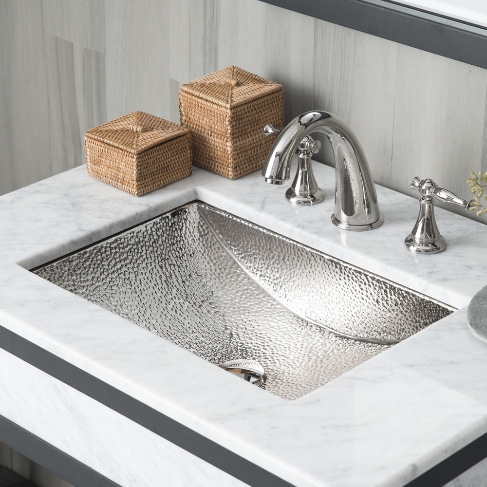
Another beautiful metal that can bring harmony to your chrome and brushed nickel faucets with it’s corresponding shiny and brushed finishes for a cohesive look.

nickel sink.jpg

Glass

Glass

Glass

Glass is a material that can be both modern and classic; creating fun and interest but also sophistication. It can easily be paired with all colours and finishes and creates a unique effect as it displays the motion of the water. It is available in a number of patterns and shapes as well.

Glass

Glass

Concrete

Cement and natural jute fibre

Cement and natural jute fibre

These concrete sinks are made of a breakthrough combination of cement and natural jute fibre. They are bold and unapologetic in their design, bringing a substantial presence to your bathroom.


These are only a few of the unique materials, shapes and designs available for bathroom sinks. In additional to a number of installation types, colours and finishes, your sink can be just as stylish and intriguing as the rest of your design elements #sinkyourteethin to sink design.

Let There Be Light!

window walls 5.jpg

White cabinetry and light countertops are often used for the fresh and airy qualities they bring to a kitchen. 

But what is fresher than fresh air itself?

Screen Shot 2019-06-12 at 1.03.13 PM.png

Expanding your window space from counter to ceiling, or even ceiling to floor provides an expansive feeling and an exceptional amount of light and fresh air.

With the possibilities available for custom cabinetry, the loss of cabinets in exchange for windows can easily be accounted for in the efficiency of modern cabinetry design. 

Screen Shot 2019-06-12 at 1.03.44 PM.png

Your connection to nature can become even greater with the inclusion of large sliding and collapsable doors. Unlike average sliding doors with several divisions and thick frames, these doors can create a seamless threshold between interior and exterior to maximize nature’s positive effects.

window walls 3.jpg

Increasing the amount of exposure to daylight you receive brings a number of health benefits such as improved mood and increased vitamin D, which can help prevent depression and SAD (Seasonal Affective Disorder). Keeping your mental health in check can in turn lead to improved physical health.

window walls 6.jpg

Large doors and windows not only blur the lines between indoor and outdoor but create both the illusion of a larger room, as well as maximize all available space by encouraging use of outdoor patios and decks. With the removal of physical boundaries we can also remove mental boundaries, allowing greater freedom and possibility.

window walls 9.jpg

How will you redefine your kitchen space? How will you bring the outdoors inside?